Introduction
Andy Warhol 2 created a series of artwork with a distinctive act of discrepancy, which he named Death and Disaster. Death and Disaster show images in one color, a reproduction of the same images, or the same images with no color entirely.
Andy Warhol majorly used repetition to communicate his ideas. He successfully employed this technique with a range of subjects over the years. The series started in 1962 and consists of a collection of around 70 slightly similar works. The artist used the element of repetition in Death and Disaster to bring out both motivated and non-motivated purposes of art.
Warhol began the series in 1962 and depicted tragedies and disasters as reported by the police or seen in newspapers across the United States. The source material was police photo archives and newspapers. The images typically enlarge the portrayed tragedies and disasters.
From his Death and Disaster series, Andy Warhol clearly brought out the motivating functions of art: art for propaganda, political change, communication, entertainment, and others. At the same time, the work also brings out the non-motivational functions, including rhythm and balance, the instinct for harmony, the expression of imagination, the mysterious experience, symbolic, universal communication, and ritualistic functions.
Video: The Death Paintings
How the paintings came about
As pointed earlier, most Andy Warhol paintings were from newspaper cuttings. In the 1960s, the country was riddled with tragic and disaster news such as tragic death of suicides, executions, and crashes.
In mid-1962, Andy Warhol and Henry Geldzahler had lunch together at Serendipity, one of the artist’s most favorite hangouts. Geldzahler, a young curator at the time, had a piece of advice for Andy Warhol, who was gaining popularity with his work on soup and Coke cans.
Geldzahler pushed the up-and-coming pop artist to move beyond consumer objects and start engaging with more serious topics. He said to Warhol 34:
It’s enough life, it’s time for a little death.
This small conversation led the artist to create some of his most influential pieces of work.
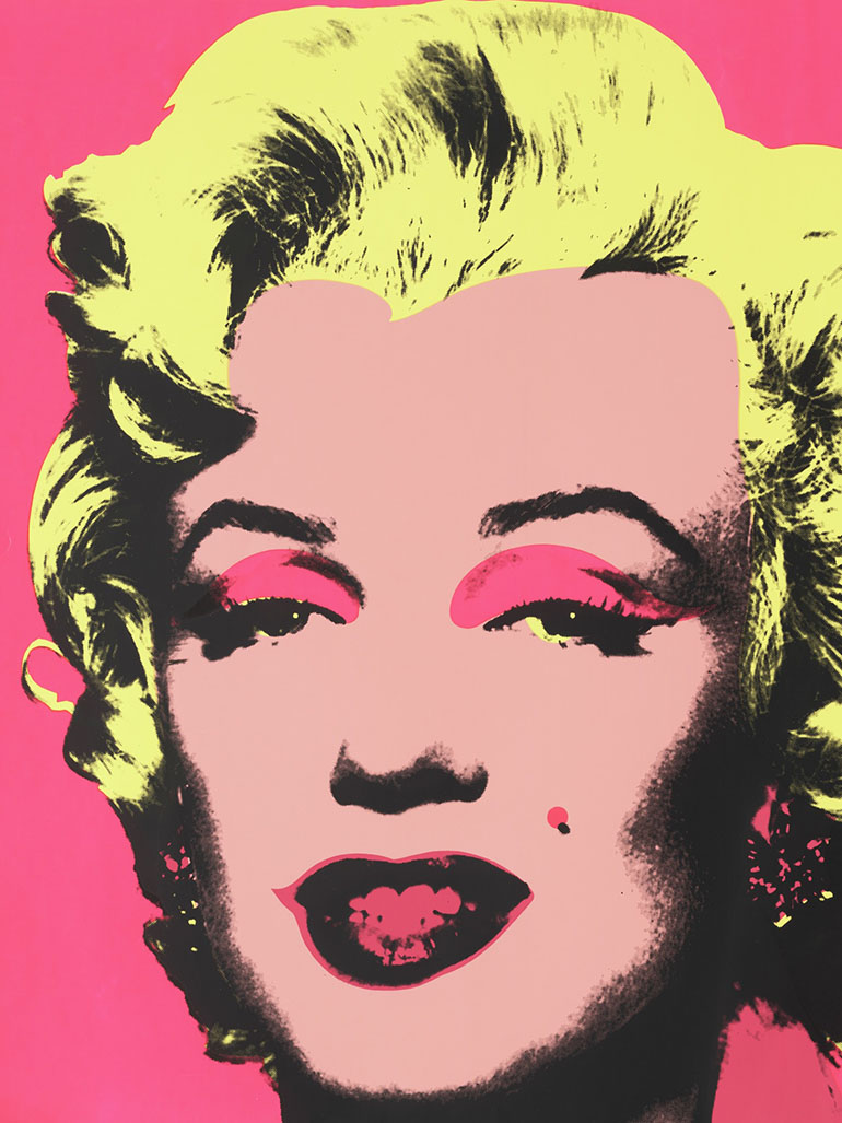
His recreation of the front page of a New York Mirror titled 129 Die in Jet!, as well as the portraits of Marilyn Monroe 56, are among his first attempts at the theme of death.
A year later, Warhol advanced beyond these askew references and began to confront fatality directly in its grim face and embarked on what came to be known as the Death and Disaster series.
Explaining what inspired him to get started on the series, the artist said 78:
I guess it was the big plane crash picture, the front page of a newspaper: 129 Die. I was also painting the Marilyns. I realized that everything I was doing must have been death. It was Christmas or Labor Day – a holiday – and every time you turned on the radio, they said something like, “4 million are going to die.” That started it. But when you see a gruesome picture over and over again, it doesn’t really have any effect.
Warhol’s inspiration
According to Andy Warhol, when you see a gruesome picture over and over again, it really doesn’t have any effect. He started painting death images because his head was preoccupied with tragic news from radios, newspapers, and television.
In his interview with Gene Swenson 910 in 1963, Andy Warhol revealed after being asked why he started with “Death” pictures:
I guess it was the big plane crash picture, the front page of the newspaper: 129 dies. I was also painting the Marilyns 1112. I realized that everything I was doing must have been Death. It was Christmas or Labor Day – a holiday- and every time you turned on the radio, they said something like ‘4 million are going to die.’ That started it. But when you see a gruesome picture over and over again, it really doesn’t have any effect.
Video: Warhol’s Factory studio manager about Death & Disaster
Analysis
Death and Disaster loosely linked a collection of more than 70 artworks, with their subjects mainly being suicides, car accidents, tainted cans of tuna fish, and electric chairs.
The series contains images with only one hue of color or a repetition of the same photograph or had a replication, with or without color.
Andy Warhol used Death and Disaster to try and lull the masses into accepting death, disasters, and tragedies as part and parcel of life.
Each image in the series is supposed to be understood and appreciated differently because they possess each separate uniqueness and freedom. The difference in each painting is gleaned by a unique act of distinction. Death and Disaster paintings draw on the viewers’ intellect to be understood
Warhol predominantly used silk-screen as a technique for mechanically iterating these garish images across wide bands of the canvas. Andy Warhol used different colors to propagate the variation when people can appreciate on their own free will.
For example, the artist’s green car accident and orange disaster are completely not accidental. They both offer viewers a chance to interpret them as they wish.
In Death and Disaster, the artist also focuses on images of the victims who became instant famous due to the frightful and unusual aspects of their death.
Works from Death and Disaster
This article will walk you through some of the pieces of work in this series and how it denotes its diversity in society.
129 Die in Jet!, 1962
Created in 1962, 129 Die in Jet! is the first artwork in the series. It is made with acrylic and pencil on canvas. The artist created the piece in the aftermath of the Air France Flight 007 crash 1314 in which 129 died on the spot and one more succumbed to injuries later (making it 130 fatalities) and only 2 survived.
The image painted was taken from the cover of New York Mirror on June 4, 1962, just a day following the accident while taking off from Paris airport to Atlanta, Georgia. At the time, it was the worst air disaster and for Warhol, it was the first time to incorporate the theme of death in his work.
The Atlanta Art Association sponsored a 30-day tour of the art treasures of Europe, and thus 106 passengers who perished were art patrons heading home to Atlanta. The tour group included civic and cultural leaders from Atlanta.
This piece reminds us that art is autonomous and universal. The artist created something new with this painting, which is that something big is not, by all means, important, but rather it means to be committed to something.
Nevertheless, 129 Die in Jet! creates some sense of emptiness thanks to the enlargement. With this artwork, enlargement and commitment eliminate the meaning. While it has different translations, 129 Die in Jet! is a tribute to those who died in that crash.
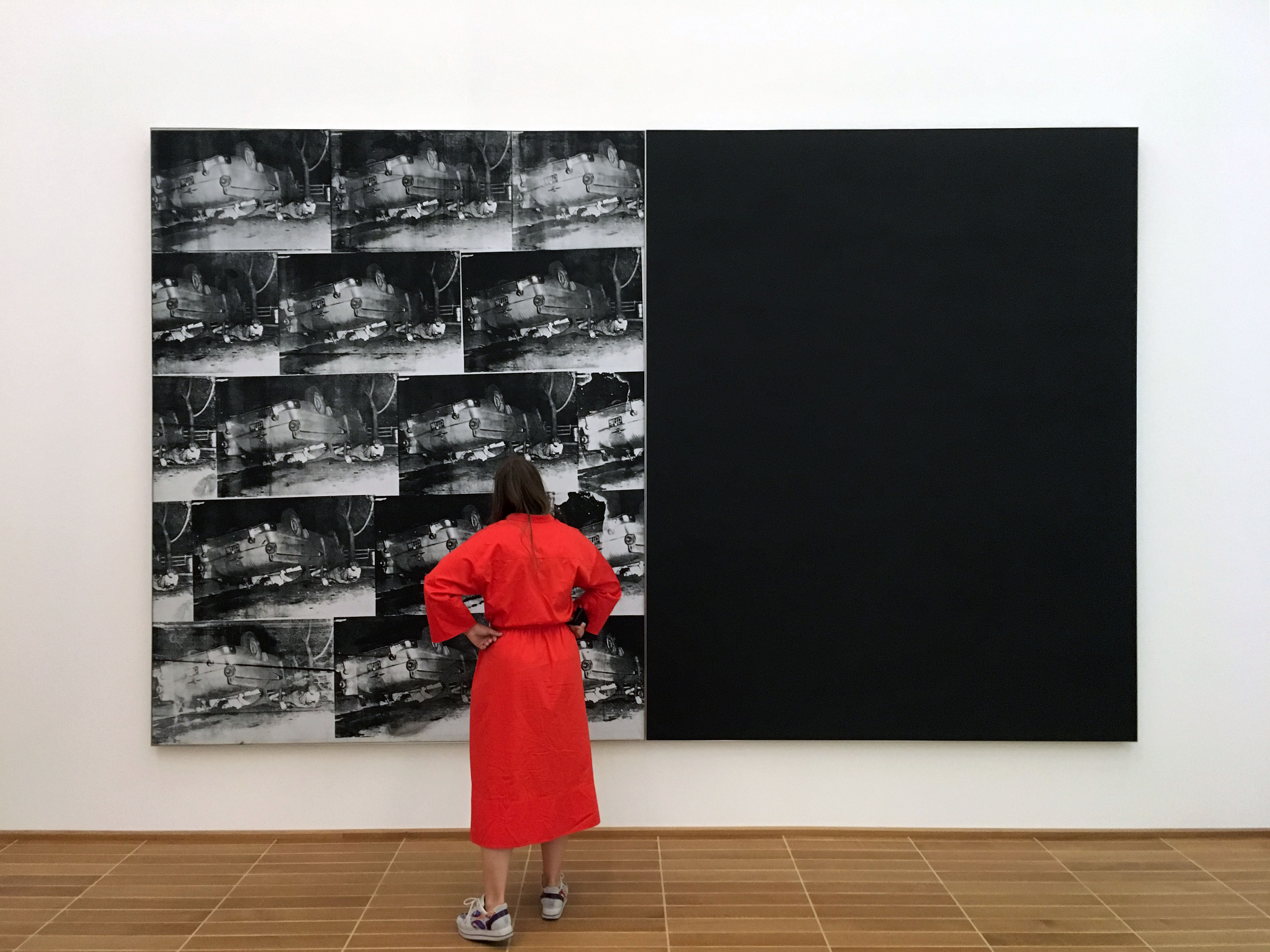
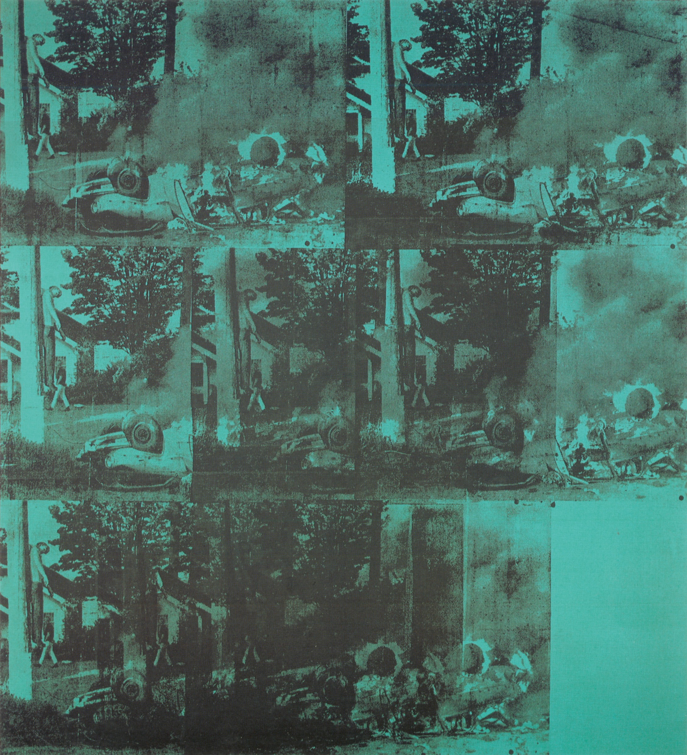
Ambulance Disaster, 1963
Executed circa 1963, Ambulance Disaster was influenced by 1960 press pictures. It first seems like a nearly abstract performance of white, black, and grey slowly coalescing into a scene of a fatal road accident. This artwork had a massive impact when it was first displayed.
Broadening his subject matter to incorporate existential motifs, the artist reinvented himself as an artist operating on a more ambitious level, taking his Pop Art 15 brand in an astounding new direction.
Speaking about Ambulance Disaster, art dealer and curator Anthony d’Offay said 1617:
Having turned away from soup cans and Coca-Cola, he did these extraordinary pictures to do with death, to do with the disaster. It’s horrifying, but the result is, strangely enough, something incredibly beautiful and incredibly powerful.
The artist painted this work in a manner that retains the sense of graininess that comes from the mass media.
As the artist said in an interview with Artnews in 1963 1819:
When you see a gruesome picture over and over again, it doesn’t really have any effect.
Ambulance Disaster was the first painting in which Warhol depicted an image of a dead subject as he continues to underscore the essence of the vanitas theme – that death will take us all – in his work.
Electric Chair, 1964
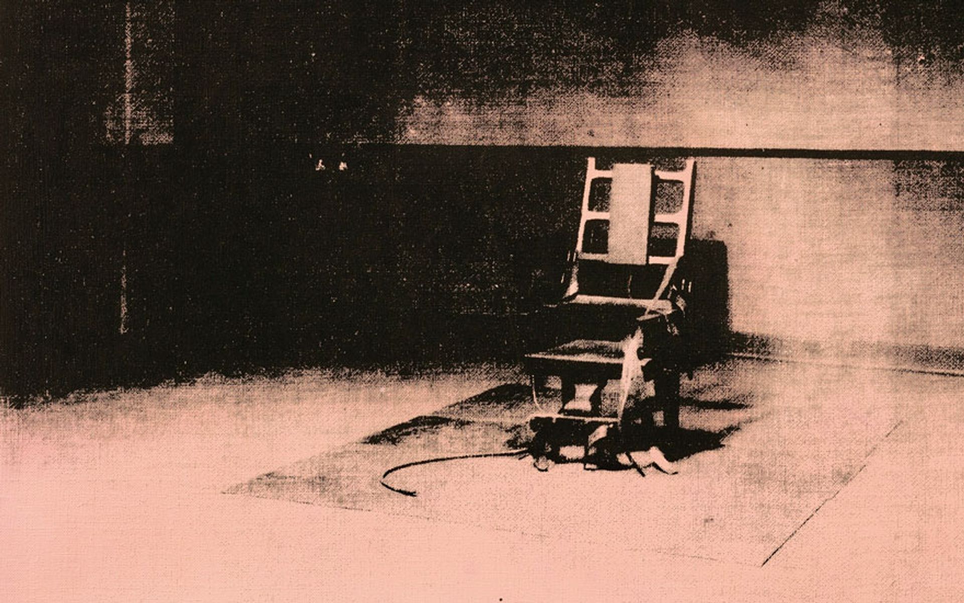
Created in 1964, Electric Chair is a medium-size canvas that was screen-printed with silver acrylic paint. The center of the canvas features an empty electric chair inside an empty room, and that particular electric chair has a high-backed frame and leather straps at its as well as longer straps and fasteners at the sides.
In front of the chair is a curled cable extending from below the seat, while behind the chair is a tiny wooden bench depicted against the back wall and faintly visible letters that read ‘Silence’ on the top-right edge of the canvas.
The space in front of the chair is irradiated, saturated with silver paint that fades, indicating dark and patchy shadows towards the corners of the composition.
One of the most noticeable features of this painting is its uneven surface, probably because the silver paint that was applied underneath a layer of vivid green shade has been sucked into the canvas during the printing process.
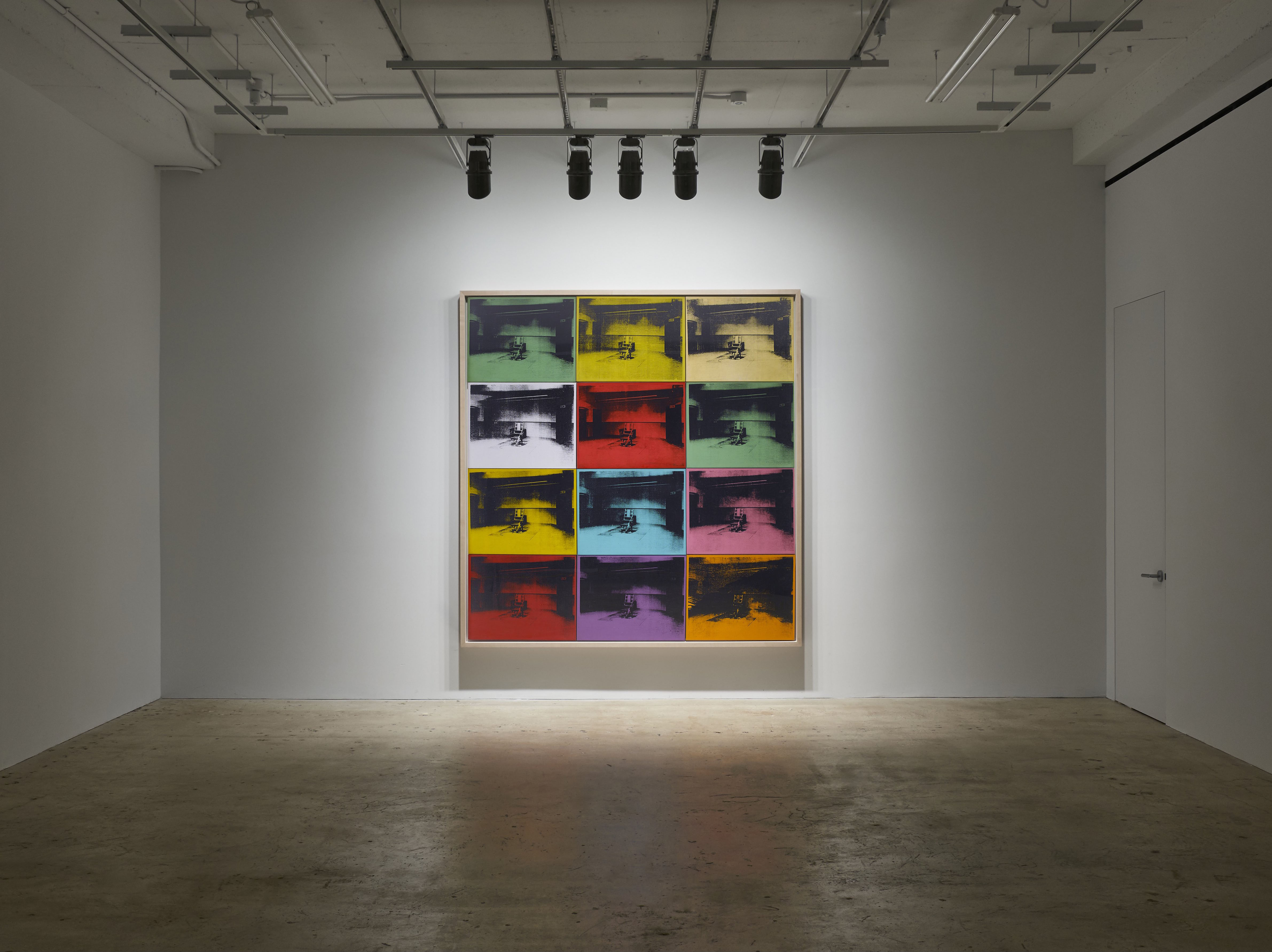
The entire painting seems like it has been lined with another canvas. The adhesive used for lining has saturated sections of the fabric of the canvas, thus creating a knock-on effect. Just like most of Warhol’s early works, this piece is also signed and dated on the verso.
The artist executed this artwork from his New York studio and he used the same process he used with Ambulance Disaster and 129 Die in Jet!
For example, in Electric Chair , Warhol appropriated the image of the chair from a press photograph dated January 13, 1953, of the death chamber at Sing Sing Prison in New York. Ethel and Julius Rosenberg were executed that same year for leaking out classified information about the atomic bomb to Russia during World War II.

Describing his printing process, the artist said in 1980 20 [/note]22:
You pick a photograph, blow it up, transfer it in glue onto silk, and then roll ink across so that the ink goes through the silk but not through the glue. That way, you get the same image, slightly different each time. It was all so simple – quick and chancy. I was thrilled with it.
Later the artist produced various iterations of the chair image but using different color compositions. For instance, he created a series of ten electric chair screen-prints on paper in 1971.
The images in these iterations are focused on the chair itself, more than the original print, in a manner that it takes up the larger real estate of the canvas, and each image was printed in bold color including blue, yellow, orange, and pink among others.
Green Car Crash, 1963
Between 1962 and 1964, Warhol embarked on a journey of creating Car Crash paintings as part of his formative series Death and Disaster.
One of the masterworks from this series is Green Car Crash or Green Burning Car I. This seminal painting is quite unforgettable as it makes varied use of what is considered the most astonishing, strange, and troubling source of the image of all those used in the series.
Going beyond just depicting the scene of the crash, this giant electric green colored painting is a poignant piece. Its ghoulish and never-ending mystifying imagery astounds with its blunt and monotonous photographic demonstration of an ordinary residential street that was shockingly turned into an appalling disaster scene neighboring on that of a surrealistic nightmare.
The artist silk-screened over a phthalo green background and manually painted the layers of colors. He used bright colors to reduce the goriness portrayed.
The work belongs to the series of paintings that Warhol created in the summer of 1963. He called it Burning Car and used the same photography source, the others being White Disaster I, White Disaster II, White Burning Car II, and White Burning Car Twice.
The images used in Green Car Disaster describe a horrible accident. They were taken by photographer John Whitehead and published in Newsweek magazine. The original car was under hot pursuit by the Seattle police, and the driver lost control at 60 miles per hour, ramming into a utility pole.
The caption accompanying the photos on the June 3, 1963, issue of the Newsweek described the scene as 2324: “End of the Chase: Pursued by a state trooper investigating a hit-and-run accident, commercial fisherman Richard J. Hubbard, 24, sped down a Seattle street at more than 60 mph, overturned, and hit a utility pole. The impact hurled him from the car, impaling him on a climbing spike. He died 35 minutes later in hospital.”
Green Car Crash is the only painting from his Burning Car series that the artist used a color that is not black and white. But one of the most standout features of this piece is the strange and extraordinary nature of imagery. For instance, in one instant, the street has been turned into a perturbing scene of hell.
Christie’s described the circumstances as follows 2526:
It was a truly unique moment of reality, this peculiar moment of transition when all values were transformed, life extinguished into death, the banal and the mundane into the exceptional and extraordinary – that particularly fascinated Warhol in many of the Car Crash images he chose, captivating his imagination at precisely the same time that it also terrified him.
The painting was owned privately for more than three decades, but in 2007, it was put up for sale where it attracted a large amount of interest. It sold for $71.7 million 2728, holding a record for being the most expensive Warhol creation at the time.
The use of the automobile in the paintings resulted in viewers questioning the originality and neutrality of Andy Warhol. Green Car Crash indicates the artist’s repetitive use to drive home a message.
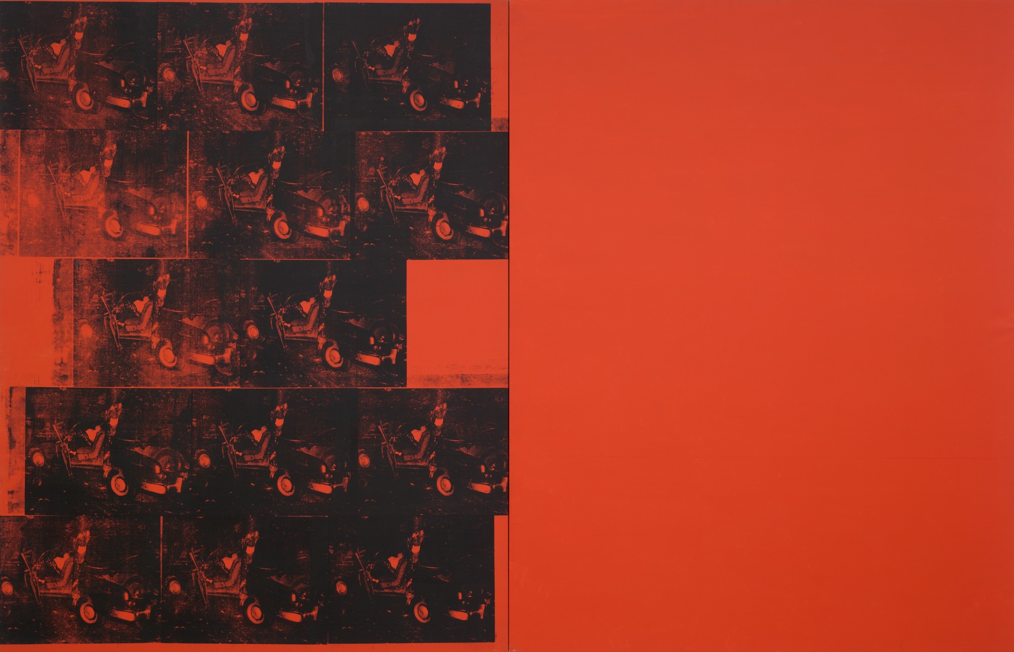
Orange Car Crash 14 Times, 1963
This painting comprises orange canvas whites divided vertically. On the left corner, there is a scene of multiple car crashes repeated fourteen times, and on the right is the orange background. The orange color might represent urgency or a fire truck, which is an ideal choice of color for this piece of work. The artist continues the theme of the car crash, which is grim and dark.
It is one of the few works from the series that took up much of the artist’s attention, though he used the same photo-silk-screening technique to repeat the image of the car crash fourteen times. While the repetition of the gruesome pictures and their fragmentation and degradation stand out, it is the areas around the canvas that the artist left blank that are crucial in inducing the emptiness of death.
On the inclusion of “a blank canvas, the same background color,” the artist stated 2930, albeit paradoxically:
The two are designed to hang together however the owner wants…It just makes them bigger and mainly makes them cost more.
Race Riot, 1963-1964
Warhol created this acrylic and silk-screen painting in 1963. Before that, a young photographer called Charles Moore took images of protest in Alabama 3132, depicting police turning water hoses on children and peaceful marchers.
These images changed the future of America forever as the majority of the white population was compelled to take a side in the growing political turbulence that was sweeping the country.
It is no surprise that Warhol used such an impactful image in his Death and Disaster series. At this point, he was still grappling with his illustration of iconic American imagery and the power of Moore’s photographs depicting race riots were just ‘too good’ to pass on.
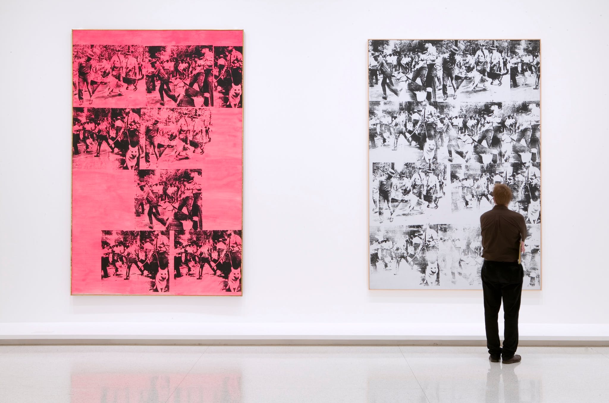
Three of Moore’s images show police dogs 33 attacking a black man. While none had the element of death, the artist was fully aware of their power and wanted to include them in his forthcoming show at the Sonnabend Gallery in Paris to show the dark underside of the infamous American Dream. He said then 3435:
My show in Paris is going to be called ‘Death in America’. I’ll show the electric-chair pictures and the dogs in Birmingham and car wrecks and some suicide pictures.
In these prints, the artist just enlarged and reversed the original photographs, but even with these not-so-subtle alterations, Moore still sued the artist for unauthorized use of his work.
Race Riot marked the first time the artist indulged in a more political subject. Despite the images’ disturbing depiction of innocent African Americans besieged by authorities and dogs, the deadpan execution of Race Riot makes the tone of the work ambiguous and hard to gauge.

Silver Car Crash (Double Disaster), 1963
This 1963 serigraph by Warhol is part of the Death and Disaster series. In 2013, the piece was sold for $105 million 3637 at Sotheby’s New York auction, setting a new record as the highest price for an artwork by Andy Warhol.
Just like other works in the series, Silver Car Crash portrays a car crash scene in which a body is twisted in the distorted interior of a silver car.
Measuring more than 13 feet wide and 8 feet tall, the artist uses silk-screen to bleakly dramatize the twisted human body and deformed metal while the reflective silver paint creates a play of light and shadow.
One of the most unique features of this artwork is the two canvases – one featuring five rows of three images repeating a mangled car and the second is just a blank silvery surface. This interesting technique was only used in seven bodies of work by the artist.
Silver Car Crash (Double Disaster) was auctioned by Sotheby’s in 2013, with Tobias Meyer, Worldwide Head of Contemporary Art at the institution, stating in The Economic Times 3839:
With Silver Car Crash (Double Disaster), Warhol consciously created work of such scale and ambition that it takes its place alongside painting such as Pablo Picasso’s Guernica 4041 and Theodore Gericault’s The Raft of the Medusa as one of the definitive masterpieces of history painting.
Suicide (Fallen Body), 1962
In this painting, Andy Warhol incorporates the image of the fallen body of Evelyn McHale into his work to communicate his thoughts on suicide. The original image was a photograph taken by student photographer Robert Wiles just moments after 20-year-old Evelyn had fallen to death on a black limousine from the 88th floor of the Empire state building.
The young lady, a bookkeeper, was engaged and just returned from visiting his fiancé in Pennsylvania. But she must have been downhearted because instead of going home, she checked into a hotel on 7th Avenue and 31st Street, where she composed a suicide note.
Evelyn then went to the 86th-floor observation deck of the Empire State Building, where she jumped to the ground. A photographer student, Richard Wiles, was nearby and took a couple of photographs that made it into Life magazine.
Her body, still in her pearls, her legs crossed elegantly, Evelyn appeared peaceful, like she was asleep, resulting in the nickname “the most beautiful suicide 4243“.
This can be attributed to the eerie manner in which her body and face were unbroken on top of the mangled metal of a limo despite the 1,000-foot fall. Warhol used this photo for his Suicide (Fallen Body) in 1962, repeating the image sixteen times. He used the replications of the image to show how the community churned celebrities.
The Orange disaster, 1963
This painting by Andy Warhol is a replica of fifteen photographs of an electric chair. The painting indicates the artist’s unnatural fascination with death and his rare and unique ways of appreciating nature.
Andy Warhol had a unique way of making distressing images into something pleasing to the eye by adding colors, in this case, orange tint, which reduces the somber mood. While the resulting images have some tones of brightness and happiness, some viewers still find them disturbing.
The reason behind the replication of images is to have them inscribed in the minds of the viewers for as long as possible. But the Orange disaster had a major deeper meaning. It was Andy Warhol’s way of voicing his opinions on capital punishment, which he was totally against.
The painting had bright contrasting colors along with deeply darkened areas that created the design. Andy Warhol’s paintings appealed to some audiences because of their simplicity and the familiar message they conveyed.
The artist believed that art is the modest form of communication, with each message being goal-oriented and may be used to reveal emotions, moods, and feelings.
Tuna Fish Disaster, 1963
Tuna Fish Disaster was created by Andy Warhol to depict the darker side of society in America. It was inspired by an event that transpired in March 1963. Two suburban women in Detroit, Michigan, tuna fish sandwiches for lunch while watching their kids play.
Shortly thereafter, they fell ill, were driven to the doctor, and later died from botulism poisoning from a contaminated can of A&P brand “chunk light” tuna.
Later, the two ladies were identified as Mrs. Brown and Mrs. McCarthy on the issue of Newsweek on April 1, 1963, with their photographs accompanied by the infamous tuna fish can that led to their demise.
The averageness of the two housewives, both middle-aged and ordinarily in appearance, fascinated Warhol, who captured those images in a collection of large-scale 44 silver paintings titled Tuna Fish Disaster for his seminal Death and Disaster series.
It highlights the type of unease underlying the collective society’s “faith” in a system that prides itself on efficiency. In this painting, the artist lets the chilling effect of the deadly tuna fish loom large over the entire scene, creating an air of death that is intensified by the astonishing size of the canvas and the application of silver paint.
Warhol zooms in on the brand name A&P, which was photographed from an overhead angle to enable the serial numbers imprinted on the lid to linger in fatal proof of its impurity. At the same time, the victims, the two females, are relegated to tiny photographs placed below the oversized tuna fish can.
The repetition of the image of two women who died from eating tuna fish, alongside the tuna cans, portrayed the idiosyncrasies of American retailers who vowed to protect consumers from harmful products. Each subject displays the symbols of unremarkable suburban life and smiles in the images that carry no indication of their tragic fate.
The painting shows that disasters like Tuna Fish can happen to any human being at any time. Andy Warhol replicates the image to ensure that it is etched on the memories of viewers for a long time. It also captures the imagination of the viewer and makes them think deeply about the painting.

Conclusion
With Death and Disaster, Warhol tried to desensitize the public into accepting death, disasters, and tragedies as part and parcel of life. Interestingly, Warhol was deeply scared of his own death 4546, but he successfully smoothed over his fears by creating and cultivating a laid-back and detached persona.
To this day, the intention of his repetition of the images is still not known, whether it was to blunt or intensify the ominous content of its contents. The artist was aware of the role of media in anesthetizing the public to violence and tragedy, as shown by the fact that the media tend to recycle the same tragic photographs of celebrities upon their death.
Death and Disaster is closely linked to Andy’s personal life, making it more relatable to the viewers than other pieces of repetition art. While works from Death and Disaster were never going to be as appealing as other art pieces, it has become one of the most admired pieces of art.