Introduction
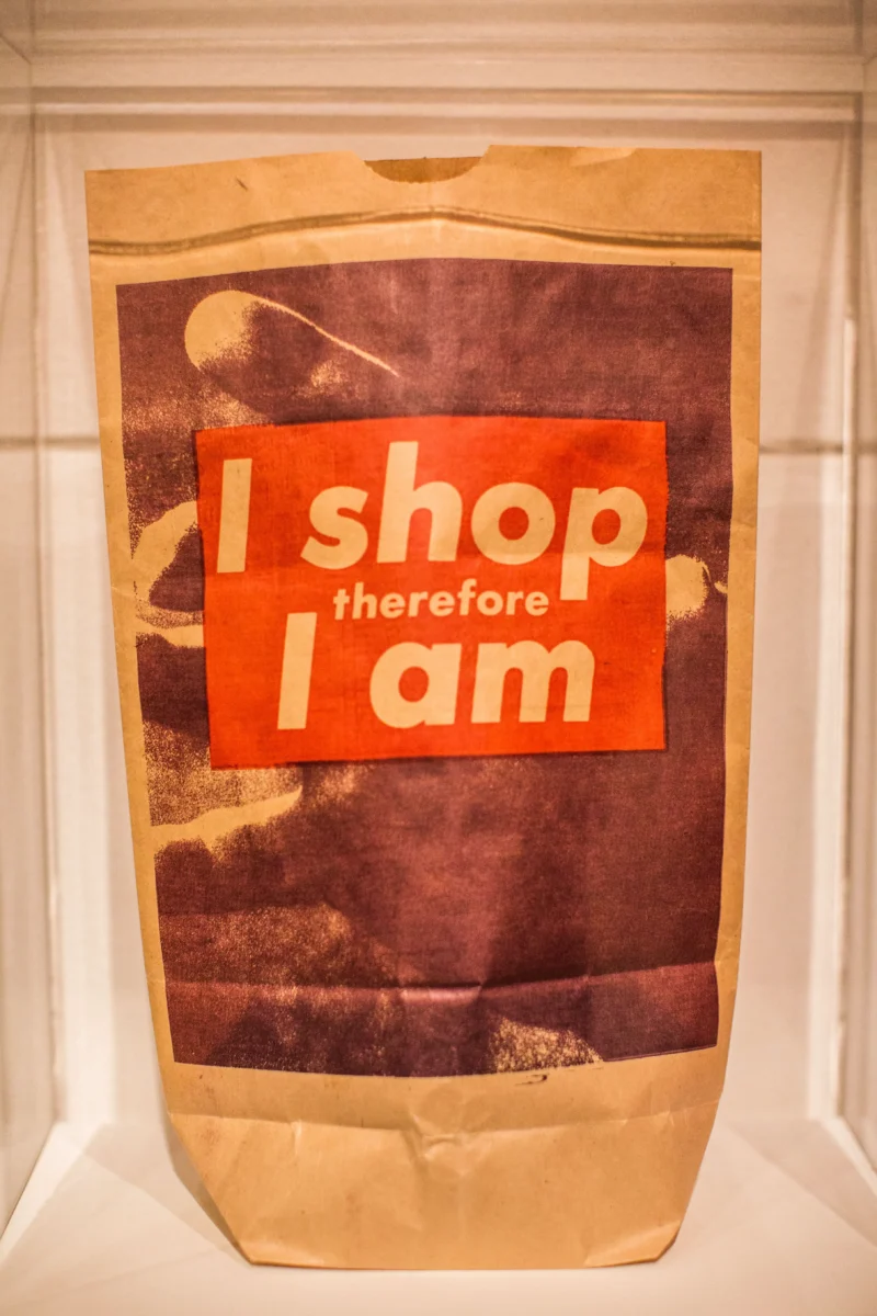
I Shop Therefore I Am (1987) is the work of Barbara Kruger 1. It became an iconic artwork, being reproduced on items such as shopping bags and other consumer 2 products such as t-shirts. Kruger has often derived images from the mass media and pasted the words over them, particularly in Futura Bold 34. She then uses advertising to design her works.
Kruger had a chance to train her designing skills at her first job as a page designer at Mademoiselle 56 magazine. This job turned her into a master at utilizing type seductively to structure, focus the image, and lure the reader to the text.
What does the work show?
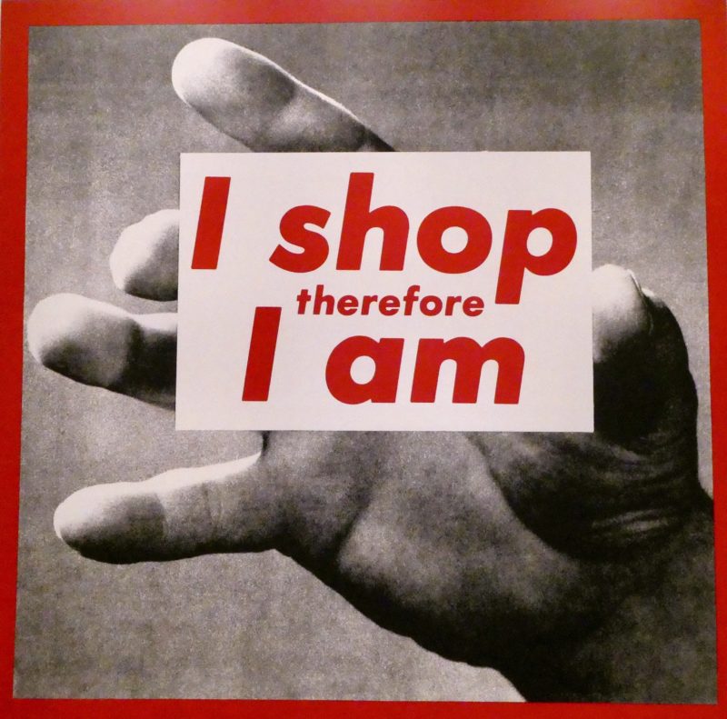
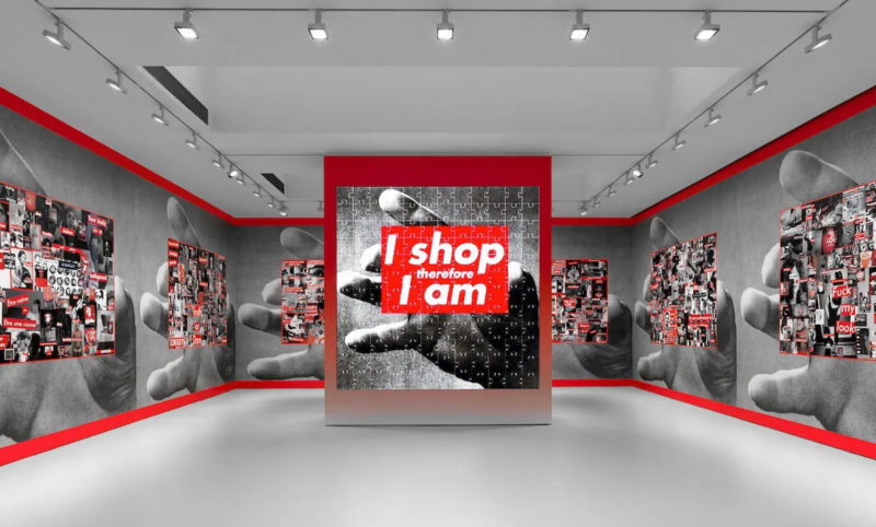
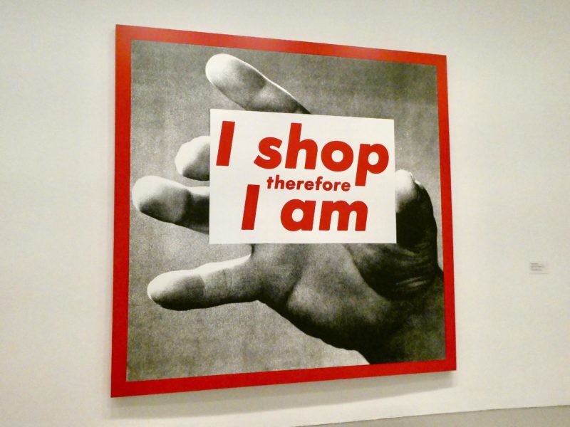
This famous image comprises a black and white photo of a hand stretching forward, and the white writing I Shop Therefore I Am designed in a red rectangle box in the middle of the portrait. The area where the hand is stretching out is lighter than the rest of the portrait, thus presenting the strong yearning to obtain material possession. The image is surrounded by a red frame, which creates a confined space and more visual contrast.
Color
When viewing the work, one will recognize the red color instantly. Therefore the main element of design in “I Shop Therefore I Am” is the rectangle. The background of the photograph is blurred to accentuate the red square and the words on it. The index finger of the hand is the most visible of the fingers. It points at the”I” part of the text. This makes the eyes of the viewer look at that section of the art before everywhere else.
Text
The fact that the text “therefore” is placed right at the center of the rectangle and is visibly smaller than other words makes the viewer read the text with a little pause after the “I shop”. This design helps accentuate the second “I”. Having both the I in relief refers to the person reading and the fact that the reader is considered the most crucial entity.
Analysis
Consumerism
Kruger associates his work with the modern consumer-driven society. The catchphrase “I shop therefore I am” was borrowed from the French philosopher Rene Descartes “I think Therefore I am’. The phrase means that provided someone is simply thinking; they are livening a meaningful existence, was sufficient proof that they did exist.
Kruger tries to imply with “I shop therefore I am” that the public is no longer defined by what it thinks, but rather by what they own. During the 1980s, society witnessed the “economic potential of working people and broadening markets, widening the availability of credit and stimulating homeownership and share ownership,” a change that seriously impacted how people consumed.
(Kruger’s) anti-consumerist art criticizes members of society who feel as though it is necessary to replace their own self-worth with materialistic items.
– Ramsey and Gallagher, 2013 78
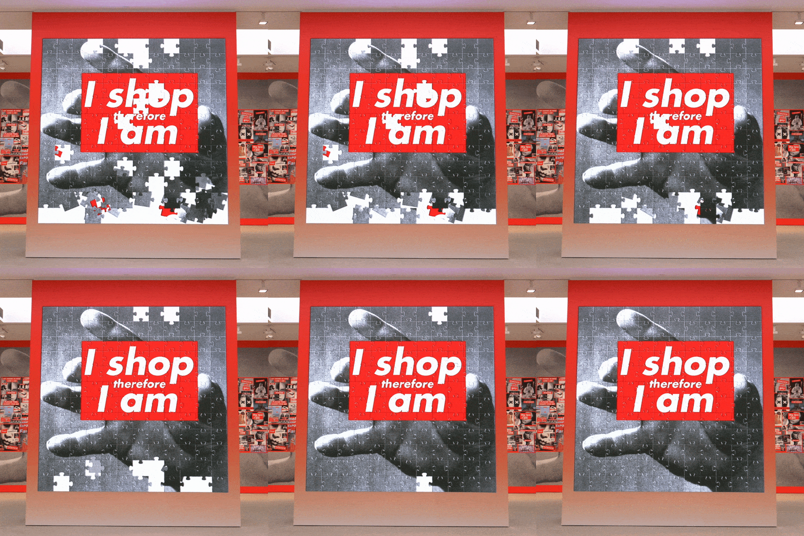
Barbara Kruger expresses her concerns with this art that the society has glided too far away from the fundamentals; it somehow has transformed into a plastic society. According to her, modern society is filled with people who focus on “what they have rather than who they are.”
Society feels as though their material possessions and social image define who they are instead of more in-depth personal attributes like accomplishments and ideas. She uses her art to highlight the shallowness of the modern consumer-driven society by juxtaposing contrasting statements.
The artist challenges the notion of identity construction through acts of consumption. However, she does not stop there in criticizing the shallow, consumer-driven minds of modern society. She went ahead to produce more artworks that bash consumer-obsessed individuals.
Descartes
By using a subtle wordplay of Descartes’s statement, the artist uses this artwork to question the importance of having material possession but with slight humor and sarcasm. I Shop Therefore I Am demonstrated one dire consequence of advertising contents such as ones on the cover of Toward a Female Liberation Movement.

The existence of self becomes embedded with the act of consuming. In the analysis of the texts, I show that advertisements create self-doubts and guilt by comparing people in real life with the unattainable ideal people. This could potentially destroy the foundation of people’s perception and security of self. The unbridgeable difference between “who I am” and “who I should be” propels people to engage in consumption. The perpetuation of this process ultimately replaces the self.
Supreme
This artwork is untitled, and just like many other artworks by Kruger and other artists, it invites different interpretations. While it questions the essence of material possessions, and to some extent, attacking consumer brands, luxurious spots, the clothing brand Supreme uses a Barbara Kruger inspired red-and-white design 910 as their logo. This action has been described as teasing the boundary between homage, parody, and theft.
Feminism
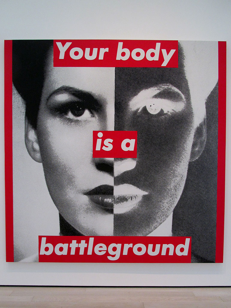
This artwork not only questions today’s materialistic society. It can also be interpreted from a feminist perspective. Kruger is also known to be a feminist artist 11. Some of her works question the influence of advertising and media, as well as the role women play in society. According to her, women feel more pressure compared to men. Therefore they are compelled to define themselves through their appearance.
Conclusion
The words Kruger uses in her works, including I shop therefore I am, have an immediate impact on the audience. They always refer to mass consumption as well as the craze of the individuals in society. Though Descartes’ theory is far more profound in meaning than something as petty as modern-day shopping, it foreshadows Kruger’s criticism that contemporary conveniences have taken away people’s need for self-actualization as well as self-worth.
Barbara Kruger is one of the most notable conceptual artists and collagists. One of the reasons why her work (I Shop Therefore I Am) stands out is its capacity to lead multiple lives. Its meaning lies squarely on the ability of the viewer to interpret. I Shop Therefore I Am is probably more relevant in today’s society than thirty years ago because today, we are more consumed by image and appearance than at any stage of civilization.
The message is clear, while the design catches the viewers’ attention, and above all, the concept plays with the idea of the Russian doll – we are placing a loud message reproving a form of culture on its own emblem.
