Philadelphia Museum of Art, 2600 Benjamin Franklin Pkwy, Philadelphia, PA 19130 Copy
39.965658, -75.181471 Copy ✓verified
On view
Please note that the painting might not be on display during your visit.
It is usually located in Gallery 267, Modern and Contemporary Art, on the second floor of the main building.
Contact the museum or check its website beforehand to confirm its availability.
Accessibility
The museum is wheelchair accessible, with elevators, ramps, and accessible restrooms available.Wheelchairs can also be borrowed at the museum entrance upon request.
Before you go
Facilities: Restrooms, gift shop, and a café are available on-site.
Time management: Allocate at least 1–2 hours to explore the museum’s collection.
Best visit time
Weekday mornings are ideal for avoiding crowds and enjoying a quieter experience.Special exhibitions and evening hours may offer additional opportunities to explore the museum at your own pace.
Directions
By car
The museum is located at the western end of the Benjamin Franklin Parkway, close to I-76 (Schuylkill Expressway) and I-676 (Vine Street Expressway).
The museum is a few minutes from Center City Philadelphia and about a 20-minute drive from the Philadelphia International Airport, depending on traffic.
By bike
The museum is next to the Schuylkill River Trail, a car-free zone for cyclists, joggers, and strollers. Bike racks are available in the parking garage and outside the North Entrance.
Indego Bike Share stations are located at the bottom of the Rocky Steps and in front of the Perelman Building at 2525 Pennsylvania Avenue.
By bus
Bus routes 7, 32, 38, 43, 48, and 49 serve the museum area. Check SEPTA’s website for schedules.
By train
SEPTA trains stop at 30th Street and Suburban Stations, both a short distance from the museum. Amtrak trains also stop at 30th Street Station.
The PATCO Speedline from South Jersey offers service to Center City Philadelphia.
Parking
Accessible parking: Available on every level of the main garage, adjacent to elevators.
Main building garage: Accessible via Kelly Drive or Anne d’Harnoncourt Drive. The garage is a short walk to the Perelman Building and a 20-minute walk to the Rodin Museum.
Off-site parking: Metered spaces are available on the Parkway between Eakins Oval and Logan Square. Two-hour parking is available near the Italian Fountain off Waterworks Drive.
Indoor
Who was Fernand Leger?
Fernand Leger was a French painter and sculpture born on February 4, 1881, and died on August 17, 1955. Leger was not only a sculptor and painter but also a filmmaker and a war veteran. It was his multidisciplinary skills that made him one of the most celebrated artists of the 21st century.
Early career
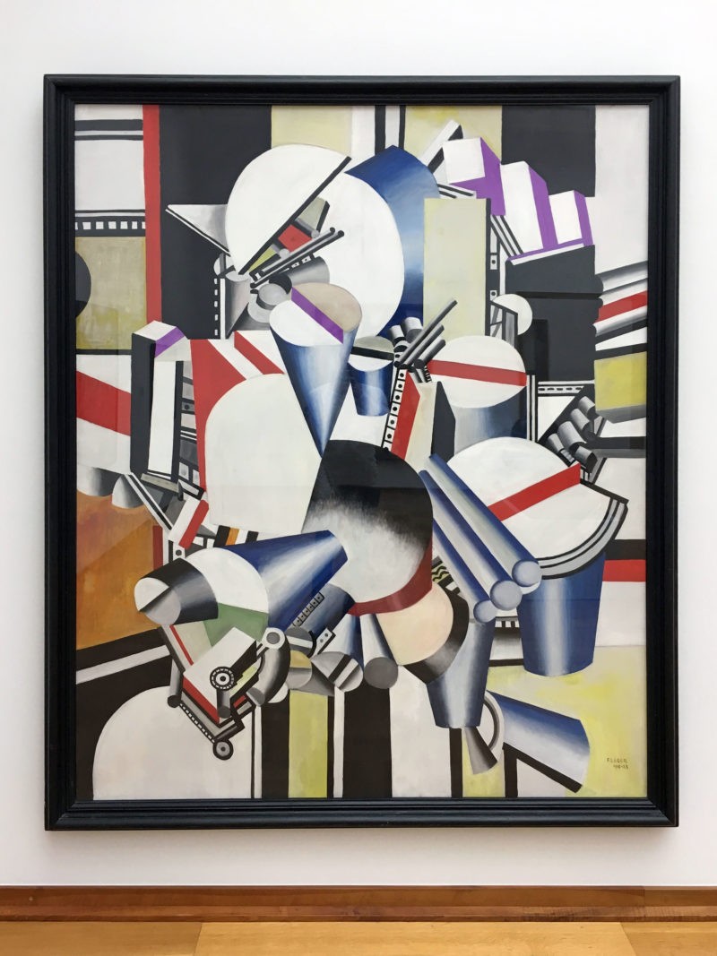
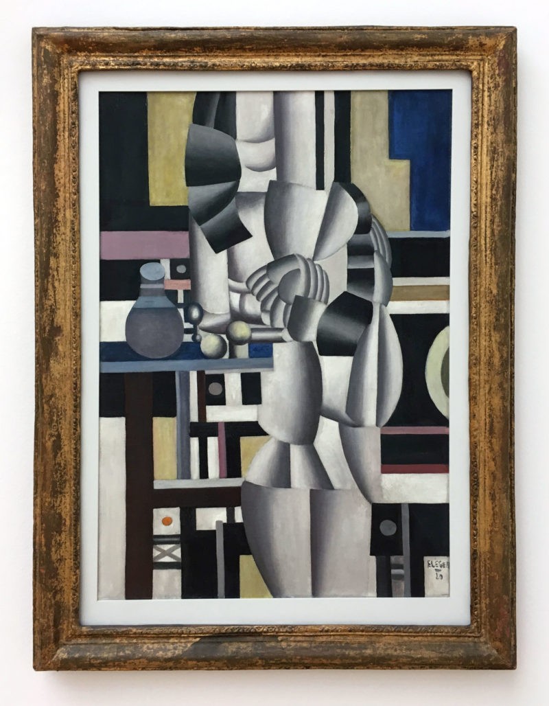
During the early stages of his career, Leger focused on cubism. He then experimented with other art fields and slowly shifted to the contemporary style of art, which was very popular in his generation. Leger developed his fixation on modernization after undergoing a “mechanical” cycle between 1918 and 1923.
Education
Fernand Leger trained as an architect in his hometown of Argentan in Lower Normandy. He moved to Paris in 1900, where he practiced his skills as an architect. After serving in the military in Versailles, the artist enrolled at the School of Decorative Arts after being rejected in his first-choice college, Ecole des Beaux-Arts.
Later, however, he joined the same school he was dismissed as a non-enrolled student. Leger said the place wasn’t as he expected, and he describes his period 12 there as “three empty and useless years.” Leger was a late-boomer, as far as painting is concerned, as he only started artistic painting at the age of 25.
Moving to New York
After World War I, Fernand Ledger changed his approach from cubism to popular modern art and focused on mechanical objects and the importance of advertising and billboards 3. His obsessions with cities saw him move to New York – the capital of the world. He was astounded by the sheer of the city, evident by his remarks to his friend 45:
I am still constantly astonished by the vertical urge of these people drunk with architecture. From my room on the thirtieth floor, the night is the most astonishing spectacle in the world. Nothing can be compared to it…. This city is infernal. A mixture of elegance and toughness.
The City, 1919
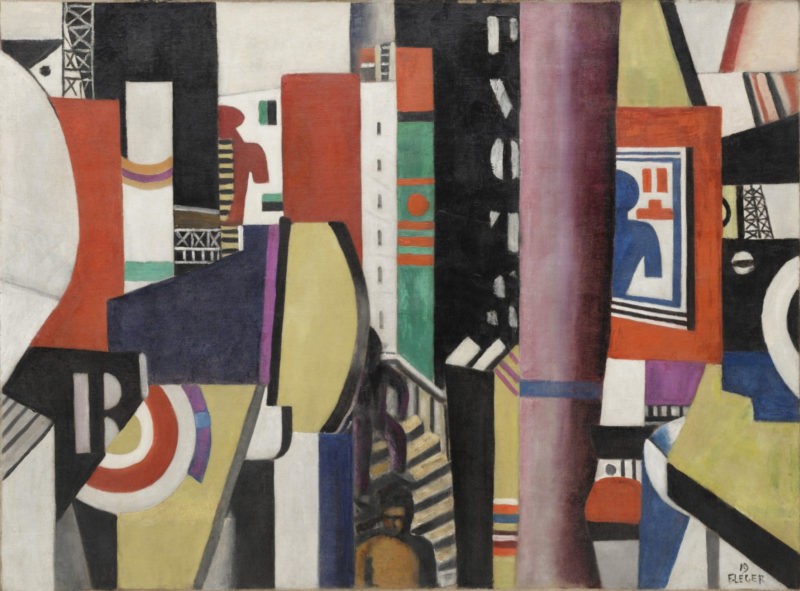
The City or La Ville in French is a 1919 painting by Fernand Leger. In The City, Leger successfully captured the disjointed rhythms of contemporary urban space and the extensive vista of its skyscrapers, bridges, and scaffolding.
The artist was a pro in abstract art, and he used his skills to make the concept relevant during his generation. Leger created The City in Cubist style and was donated to the Philadelphia Museum of Art by Albert Eugene Gallatin in 1952. While it has been a part of the museum’s collection for decades, it has also been loaned for exhibitions.
Why did he paint The City?
Leger had a unique fascination with cities. “How I will gobble Paris up if I’m lucky enough to go back there!,” he wrote in a letter from the frontlines of World War I. Leger was not afraid of urbanization and the effects that it would bring. He wanted to make the cities part of him. The city points the way artists should engage with the uprising of the cities around them.
The City is simply a vision from the 20th century of the modern environment. His use of bold, geometrical images and bright colors perfectly characterizes a typical metropolitan.
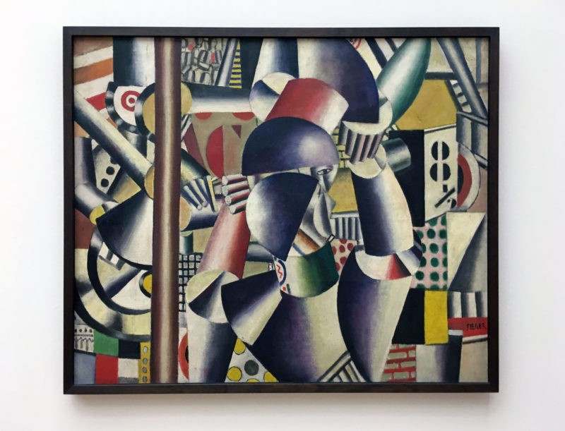
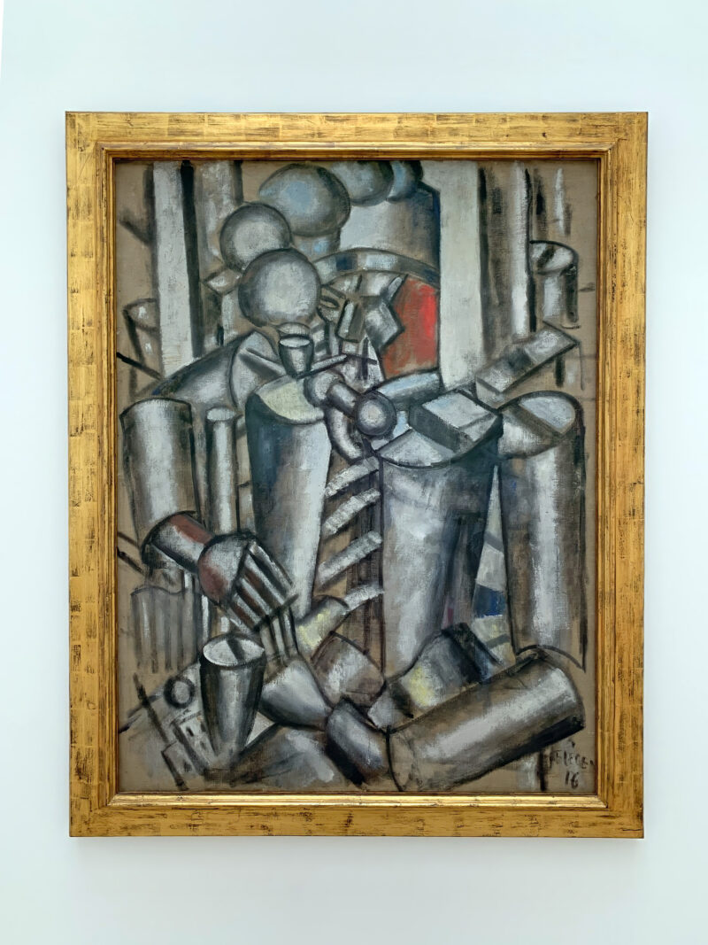
Leger drew inspiration from his time as a soldier during World War I. The City was created just three years after leaving the war camp. Before producing The City, the artist created several sketches of airplanes, artillery pieces, and fellow soldiers. He painted while in the trenches. Perhaps the most famous work he did while in war camp is Soldier With a Pipe, which he painted while on leave.
Reception
Many commentators claim that The City is one of the artist’s most famous artworks. And it is hard to argue with their claims. Leger created this colorful piece using a wide range of unique brushstrokes. He purposefully demonstrated the inconsistencies between skyscrapers, bridges, scaffoldings, stairs, and a tiny street section at the heart of the vibrancy of the city that depicts the “city” feel.
Many critics, though, never appreciated the style in which he painted The City. Some were put off by the geometric-shaped objects in the painting, while others were not in love with the bright colors. However, writing in her essay for Leger’s 1998 exhibition at the MoMA, Carolyn Lanchner states 67:
Most critics saw and see Leger as a painter of hard, precise drawn contours and smooth slick surfaces that conceal the trace of the brush, but this is the myth. If a viewer takes the trouble to look, it becomes obvious that Leger was a painter in love with paint, and almost every canvas exhibits his enjoyment of it. He leaves pentimenti visible, edges are more often than not skewed, one side of a form is generally asymmetrical with the other, and large areas of bright, saturated color often cohabit with smaller patches of strange, strange, pastel bedroom hues. As Leger never tired of saying, his paintings are not copies of things in the visible world but their equivalent in the paint.
The City didn’t receive much success, though, because of the painting style. Leger wasn’t as famous as some of the artists in his generation, like Pablo Picasso 89. The problem, according to curator Anna Vallye 1011 was:
If ‘Leger’s work has proven at all intractable, it is to the extent that is it confounds the roaster of binary oppositions we tend to view as fundamental to the history of modern art, by upending the categorical distinction often drawn between ”modernism”… and the ”avant-garde,” meaning that Leger is perceived as “an artist of radical impunity.”
The City didn’t receive much recognition because it is too decorative, too simplified, too obvious, and unfinished. While this is true, many people miss the ‘artist’s intellectual intent and his emphasis on content.
Despite this criticism, Leger and his painting The City, has influenced many artists, including Stuart Davis, Philip Guston, Milton Resnick, Willem de Kooning 12, Louise Bourgeois 13, and even Andy Warhol 14.
Leger states why he likes using colors 1516:
Color rushes in like a torrent. It swallows up the walls, the streets… When one opens a window, a piece of shrill publicity blows in the wind… An exuberance of color and noise.
Video: Curator Michael Taylor discusses The City
Analysis
Fernand Leger is considered the distinguished painter of the modern city. He successfully predicted the rise of megacities. In some sense, The City is a grand statement of celebrating the energy of contemporary urban life.
In the painting, Leger has included the significant characteristics of a city’s appearance, including apartment buildings, billowing smoke, billboards, scaffolding, and a telephone pole, all in an irregular abstract shape in bright shades.
In an essay, Jodi Hauptmann states this 1718 about The City:
(Leger) found the essence of the modern in the city. Present-day life, more fragmented and faster moving than life in previous eras, had to accept it as a means of expression and an art of dynamic divisionism.
According to the artist,
If the pictorial expression has changed, it is because modern life has necessitated it. The thing that is imagined is less fixed; the object exposes itself less than it did formerly. When one crosses a landscape by automobile or express train, it becomes fragmented; it loses its descriptive value but gains in synthetic value. The view through the door of the railroad car or the automobile windshield, in combination with the speed, has altered the habitual look of things. A modern man registers a hundred times more sensory impressions than an eighteenth-century artist.
Hauptmann continues,
Leger expresses the new complexity and simultaneity, crowds and chaos, primarily through his value of fragmented planes and contrasts and ruptures in shape and color. He believed that La Vile (The City) was revolutionary because of its ability to achieve depth and dynamism without resorting to old-fashioned initiative techniques like chiaroscuro and modeling. Overlapping and layered planes depict urban density, and fragments show the speed of urban experience. The broken views of billboard texts and images indicate not only the multiple stimuli available in the city but, even more, the speech with which residents traverse urban space.
You will likely be disoriented when one stands in front of The City. The senses are as overwhelming as standing in front of the actual city. In the painting, the artist proposes the “law of contrasts,” where oppositions in line, color, and form compel the eye to move frequently but always within the painting itself.
Conclusion
In this work, Leger successfully mimicked the vitality and variety of a real city. Regardless of how you interpret The City, there is no denying that Fernand Leger was a skillful artist of his generation. Poet Yvan Goll recalls Leger’s fascination with cities 1920 by saying:
The metropolis shook (Leger) like an electrical current in the water. In that dynamic experience, his energies exploded and tore everything apart.
Unlike the views of Goll, who insinuates that everything comes apart for Leger, Vallye thinks that the artist did bring it all together. According to Goll, the power of the painting comes from “Leger’s invention of an intermediary condition for the work, at once painting and not-painting, in which painting begins to assume the qualities of cultural forms less venerable and less elite- the ”minor’ and ”commercial’ arts, and the mass media.”
